Welcome to meatplotlib.org!
Blue Meatball vs. Red Worm
![]()

Two graphic powerhouses are duking it out. Which one will win? The meatball is meaty, but worms are also made of meat (probably not as tasty though). Have you chosen a side? This design-focused history of NASA’s logos may help.
Down with the pie: a subtle argument for bacon

Learn about chart formatting in an engaging context: bacon! Salvaging the pie will help you not ever use a pie chart again (adn your audience will thank you). This lovely ditty comes from the killer data vis blog from Darkhorse Analytics, written by Joey Cherdarchuk. While the author is Canadian, the bacon is strikingly linear.
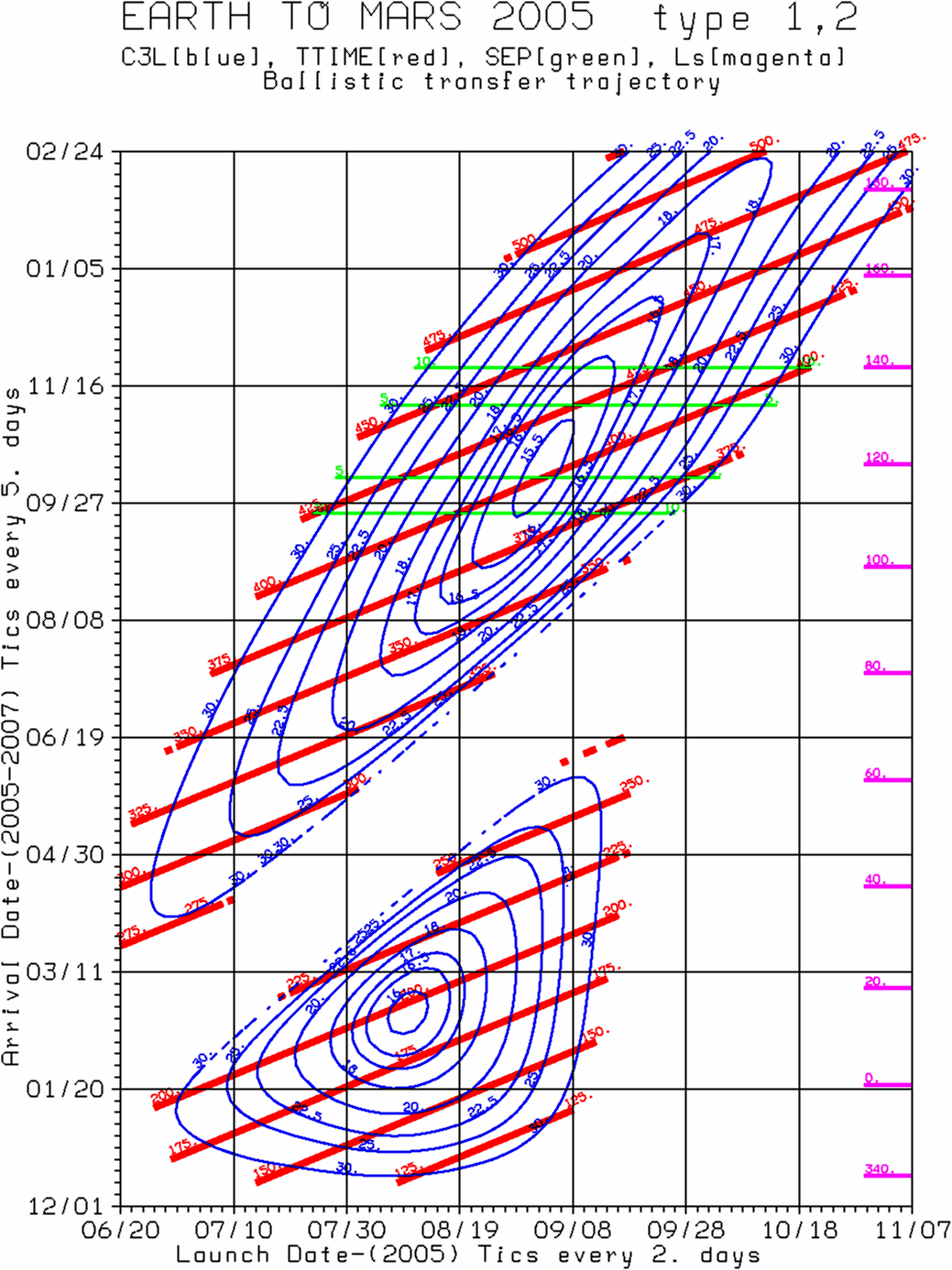
The Porkchop Plot
The plot that started it all. It’s a meat-based rocket logistics visualization. Here’s a nice summary from NASA JPL. ht to rocket scientist Caley Burke for sharing some wisdom.
Contribute a meatplot
Do you have a plot from your own awesome science that resembles bacon, fat back, or ribs? Maybe a feature request? Drop a line and I’ll post it here.
What is this new mpl?
I’m still trying to figure that out. It began with learning about porkchop plots from a talk given by NASA’s Caley Burke in early 2018 swiftly followed by purchasing this domain. Tomorrow is anyone’s guess.